Model Projections for Precipitation in the Tuolumne Watershed

Overview and Methodology

The city of San Francisco depends on water from the Hetch Hetchy Reservoir which is filled from precipitation in the Tuolumne River watershed. I was interested in seeing what models of future climate thought about the effect of climate change on San Francisco’s water supply. Hetch Hetchy supplies 80% of the water for 2.6 million people1, so the effects of climate change could be quite significant.

In this post, I show how to use tools that we developed at Planet OS along with the data analysis tools in R to explore what climate models have to say about the future of the watershed.

The NASA OpenNEX project includes the DCP-30 dataset that is based on the CMIP-5 climate model runs designed facilitate comparison between various climate models created by institutions around the globe under a set of specified climate assumptions. DCP-30 contains data from 33 different models under 4 different scenarios picked to represent different options available to policymakers.2

Planet OS has developed an online tool to process the OpenNEX data into managable datasets to investigate specific cases. This tool is available at http://opennex.planetos.com.

In this case, we’ll use watershed information3 in conjunction with the Earth System Model/Modular Ocean Model from NOAA’s Geophysical Fluid Dynamics Laboratory (GFDL-ESM2M)4 to get a set of predictions on precipitation. We’ll compare model results for precipitation across all four scenarios.

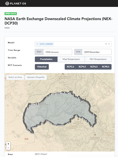
The selection screen in Planet OS’s OpenNEX Access Interface looks like this:

The selection interface

The dataset selection for the data used here can be accessed at http://opennex.planetos.com/dcp30/i5End.

To instantiate the data construction tool and create a NetCDF file with the data used in this report, run the following script on a Linux or Mac system with Docker5 installed:

1
$ curl -sS http://opennex.planetos.com/p/i5End | bash /dev/stdin -a -f nc >

This will generate a data.nc file in the current directory.6

Using R to Process the Model Data

We’ll use the R language to explore and understand the model data that we retrieved.7 I’ll show the R code that we’re using to process the data as we go along.

First, let’s load some important R libraries for this project and some constants that we’ll use later:

1
2
3
4
5
6
7
8
9
10
11
12
13
14
15
16
17
18
library(ggplot2)
library(ncdf4)
library(ggmap)
library(colorspace)
library(colorRamps)
library(raster)
library(magrittr)
library(dplyr)
library(cowplot)

light.purple <- "#8828BC"
sc.blue <- "#094672"

# Climate science uses a fixed 365 day year for better comparisons
month.days <- c(31, 28, 31, 30, 31, 30, 31, 31, 30, 31, 30, 31)

# Where we put the curl output
data.file <- "~/tmp/planetos/tuolumne-all.nc"

Results

To understand how precipitation varies over the region on average, let’s create a function that computes the average rainfall in each grid square in the DCP-30 data:

1
2
3
4
5
6
7
8
9
10
11
12
13
14
15
16
17
18
19
20
21
22
23
24
25
26
27
28
29
30
31
32
cvt.to.cm.per.year <- function(kg.per.m2.per.sec) {
  # 1kg of water = 1000 cm^3
  # 1kg/m^2 = 1mm of accumulation
  (365*86400)*0.1*kg.per.m2.per.sec
}

cvt.to.in.per.year <- function(kg.per.m2.per.sec) cvt.to.cm.per.year(kg.per.m2.per.sec)/2.54

avg.precip <- function(file.name, variable="pr", offset=0) {
  src <- nc_open(file.name)
  lats=ncvar_get(src,"lat")
  lons=ncvar_get(src,"lon")

  num.months <- src$dim[1]$time$len # No. of months
  base <- ncvar_get(src, variable,
                    start=c(1,1,1+offset),
                    count=c(-1,-1,1))
  summed <- Reduce(function(accum, i) {
    this <- ncvar_get(src, variable,
                      start=c(1,1,i),
                      count=c(-1,-1,1))
    accum + this},
    (2+offset):num.months,
    base)
  nc_close(src)
  avg <- summed / (num.months - offset)
  avg.in <- cvt.to.in.per.year(avg)
  print(sprintf("Overall mean rainfall is %.2f inches/year", mean(avg.in, na.rm=T)))
  r <- raster(avg.in)
  extent(r) <- extent(c(lats[1], lats[length(lats)], lons[1]-360, lons[length(lons)]-360))
  flip(t(r),"y")
}

To understand these averages, we’ll use the ggmap library to render them on a map:

1
2
3
4
5
6
7
8
9
10
11
12
13
14
15
16
17
18
19
bbox <- function(r, frame=0.25) {
  e <- extent(r)
  c(left=xmin(e)-frame,
    right=xmax(e)+frame,
    top=ymax(e)+frame,
    bottom=ymin(e)-frame)
}

map.raster <- function(r, zoom=10) {
  r.bb <- bbox(r, frame=0.05)
  map <- get_stamenmap(r.bb, zoom = zoom, maptype = "terrain")
  df <- data.frame(rasterToPoints(r))
  pal <- sequential_hcl(40, h = 335, c. = c(63, 87), l = c(10, 96), power = 1)
  ggmap(map, darken=0.4) +
    geom_tile(mapping=aes(x,y,fill=layer), data=df, alpha=0.5) +
    scale_fill_gradientn(colors=matlab.like2(40), name="Precip (in)") +
    ggtitle("Mean Annual Precipitation in the Tuolumne Watershed (2006-2099)") +
    theme(axis.title=element_blank())
}

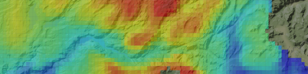
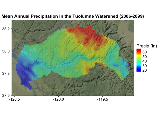
The model gives us a picture of distribution of precipitation across the watershed:

1
map.raster(avg.precip(data.file, "pr_rcp45", offset=12*(2006-1950)))

We can see how each of the scenarios changes over time. To do this, we view the mean precipitation (in inches8) for the overall watershed by year for each scenario.

First, we’ll compute the values:

1
2
3
4
5
6
7
8
9
10
11
12
13
14
15
16
17
18
19
20
21
22
23
24
25
26
27
28
29
30
31
32
33
34
35
36
37
annual.level <- function(file.name, variable="pr") {
  src <- nc_open(file.name)
  num.months <- src$dim[1]$time$len # No. of months
  vec <- sapply(seq(1, num.months, 12),
         function(i) {
           tmp <- ncvar_get(src, variable,
                            start=c(1,1,i),
                            count=c(-1,-1,12))
           tmp %>%
             mean(na.rm=T) %>%
             cvt.to.in.per.year
         })
  df <- data.frame(Year=1950:2099, Precipitation=vec)
}

combine.dfs <- function(df.1, df.2) {
  precip <- apply(cbind(df.1$Precipitation, df.2$Precipitation), 1, sum, na.rm=T)
  data.frame(Year=df.1$Year, Precipitation=precip)
}

all.scenarios <- function(file.name) {
  by.year.h <- annual.level(file.name, variable = "pr_historical")
  by.year.26 <- annual.level(file.name, variable = "pr_rcp26")
  by.year.45 <- annual.level(file.name, variable = "pr_rcp45")
  by.year.60 <- annual.level(file.name, variable = "pr_rcp60")
  by.year.85 <- annual.level(file.name, variable = "pr_rcp85")

  comb.26 <- combine.dfs(by.year.h, by.year.26) %>% mutate(scenario="RCP 2.6")
  comb.45 <- combine.dfs(by.year.h, by.year.45) %>% mutate(scenario="RCP 4.5")
  comb.60 <- combine.dfs(by.year.h, by.year.60) %>% mutate(scenario="RCP 6.0")
  comb.85 <- combine.dfs(by.year.h, by.year.85) %>% mutate(scenario="RCP 8.5")

  combined <- rbind(comb.26, comb.45, comb.60, comb.85) %>%
    mutate(Decade=Year-(Year%%10))
}

combined.trends <- all.scenarios(data.file)

Now that we’ve computed the data and combined it into a single data frame, let’s take a look at it:

1
2
3
4
5
6
7
8
9
10
11
12
13
14
15
16
17
18
19
20
plot.annual <- function(annual.results) {
  ggplot(annual.results, aes(x=Year, y=Precipitation)) +
    geom_line() +
    geom_smooth() +
    annotate(geom="rect", xmin=1950, xmax=2005, ymin=0, ymax=Inf,
              fill=light.purple, alpha=0.2) +
    annotate(geom="text", label="Retrospective",
             x=2005, y=0, vjust=-.4, hjust=1.4) +
    annotate(geom="text", label="Prospective",
             x=2005, y=0, vjust=-.4, hjust=-0.4) +
    geom_hline(yintercept=30, linetype="dashed", color="#888888") +
    geom_hline(yintercept=60, linetype="dashed", color="#888888") +
    ggtitle("Tuolumne Watershed Precipitation (inches)")
}

plot.all.scenarios <- function(combined) {
  plot.annual(combined) + facet_wrap(~ scenario, ncol=1)
}

plot.all.scenarios(combined.trends)

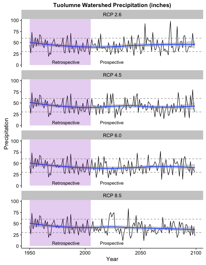
It looks here like the precipitation has a slight downward trend in the higher scenarios. Indeed, fitting a simple linear model shows a downward coefficient of 0.06 inches/year for the RCP 8.5 scenario.

The coefficients for each model are here:

1
2
3
4
5
6
7
8
9
10
11
12
13
14
model.table <- function(combined) {
  scenarios <- c("RCP 2.6", "RCP 4.5", "RCP 6.0", "RCP 8.5")
  coeffs <- sapply(scenarios,
         function(scenario) {
           lm(Precipitation ~ Year, data=combined[combined$scenario==scenario,])$coefficients[["Year"]]
         })
  data.frame(Scenario=factor(scenarios), Coefficient=coeffs)
}

print(xtable(model.table(combined.trends), align="rrl"),
      type="HTML",
      html.table.attributes = "",
      include.rownames=FALSE,
      sanitize.text.function = function(x){x})
Scenario Coefficient
RCP 2.6 0.01
RCP 4.5 -0.03
RCP 6.0 -0.03
RCP 8.5 -0.06

While the negative coefficients above aren’t that large, the model seems to understate the effect near the end if we look at the LOESS curve in the chart. Note also how the number of years below the 30" level (the lower dashed line) increase in the high carbon scenarios while the years above 60" (the upper dashed line) all but disappear towards the end of the century.

Charting the high and low precipitation years in each decade for each scenario lets us see this effect more clearly:

1
2
3
4
5
6
7
8
9
10
11
12
13
14
15
16
17
18
19
20
21
22
23
24
25
26
27
28
29
30
31
plot.low.rain.years <- function(combined, limit) {
  low <- combined %>%
    mutate(Decade=Year-(Year%%10)) %>%
    group_by(scenario, Decade) %>%
    summarise(Low=sum(Precipitation < limit))
  ggplot(low, aes(Decade, Low)) +
    geom_bar(stat="identity", fill="#880000") +
    facet_wrap(~ scenario, ncol=1) +
    ylab(sprintf('Years below %d" precipitation', limit)) +
    ggtitle("Low Precipitation Years by Decade")
}

plot.high.rain.years <- function(combined, limit) {
  high <- combined %>%
    mutate(Decade=Year-(Year%%10)) %>%
    group_by(scenario, Decade) %>%
    summarise(high=sum(Precipitation > limit))
  ggplot(high, aes(Decade, high)) +
    geom_bar(stat="identity", fill=sc.blue) +
    facet_wrap(~ scenario, ncol=1) +
    ylab(sprintf('Years above %d" precipitation', limit)) +
    ggtitle("High Precipitation Years by Decade")
}

plot.hilo <- function(combined, high.limit, low.limit) {
  hi <- plot.high.rain.years(combined, high.limit)
  lo <- plot.low.rain.years(combined, low.limit)
  plot_grid(hi, lo, align = "h")
}

plot.hilo(combined.trends, 60, 30)

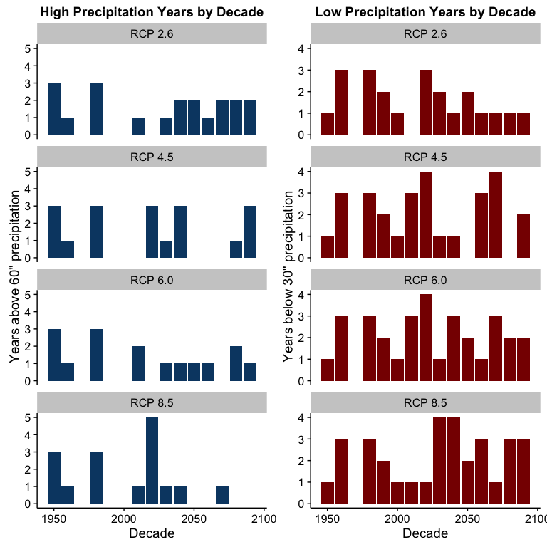
This chart would seem to indicate that higher atmospheric carbon levels are likely to be associated with increased drought risk and increased risk to the sufficient water supply in San Francisco.

A more detailed study would have to be done to quantify what the actual effect to the water levels in Hetch Hetchy might be, but these results indicate that that study might be justified.


  1. https://en.wikipedia.org/wiki/Hetch_Hetchy#The_Hetch_Hetchy_Project

  2. See a description of the 4 scenarios in “The representative concentration pathways: an overview” http://link.springer.com/article/10.1007/s10584-011-0148-z

  3. The watershed definition is from the file TUO_watersheds.kml downloaded from UC Davis Center for Watershed Sciences http://hydra.ucdavis.edu/watershed/tuolumne

  4. See http://www.gfdl.noaa.gov/earth-system-model for more information and access to source code for this model.

  5. Docker is a containerization technology that lets you run programs without worrying about installing dependencies or effecting other parts of your system. You can learn more about installing it at http://www.docker.com.

  6. The data access tool is still in pre-release and you’ll need special credentials to use it. Contact us for more details.

  7. If you’re not familiar with R, it’s a language especially tailored for the statistical analysis of data. You can learn more about it here: https://www.r-project.org. I use RStudio, a free integrated environment for R that you can get here: https://www.rstudio.com.

  8. Precipitation in the OpenNEX files is measured in $\frac{kg}{m^{2}s}$. We can use the fact that $1\text{kg}$ of water is $1000 \text{cm}^3$ to understand that this is $1 mm/s$ of accumulation. To convert to $inches/year$, we can use the following formula: $\frac{365\cdot86400\cdot0.1p}{2.54}$.